What Makes a High-Converting Dental Website?
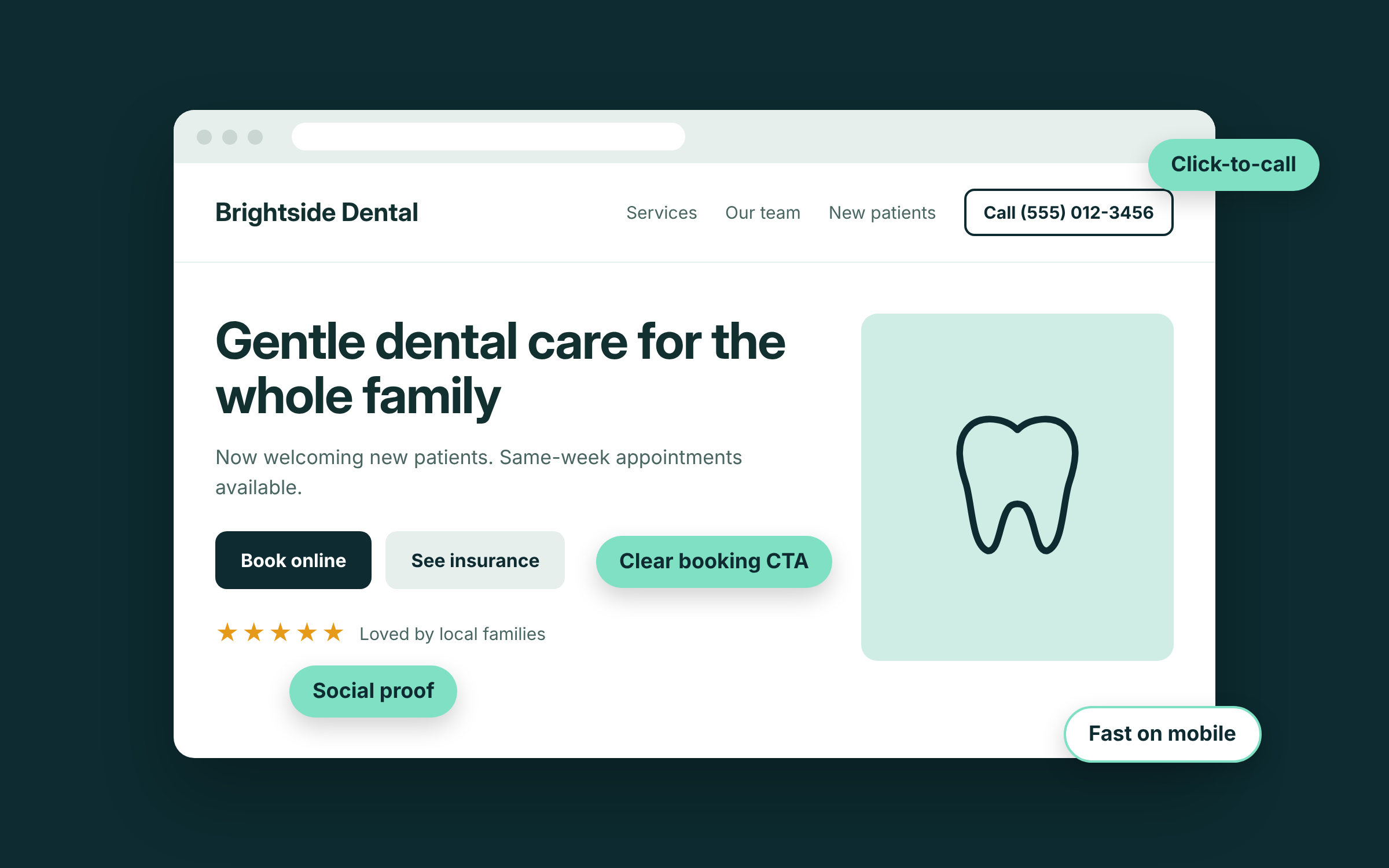
A high-converting dental website does two things well: it makes booking an appointment effortless, and it makes a nervous patient trust you before they ever walk in. Most dental sites that get traffic but few bookings are failing at one of those two jobs.
I've spent the last two years maintaining and building websites for a dental group with more than 25 locations. These are the factors I see make the biggest difference, in roughly the order I'd fix them.
The single biggest conversion factor is giving visitors an easy way to book. If someone has decided they want an appointment, they should never have to hunt for how to get one.
At minimum, a "Book Appointment" button should sit in the navigation bar on every page and again in the hero section at the top of the homepage. That button should lead somewhere simple: an online booking tool, or a short form that asks only for what the front desk actually needs. On mobile, a tap-to-call phone number should always be one thumb away.
Every extra click or required field between "I need a dentist" and "I'm booked" loses patients. Some visitors want to book online at 10pm. Others want to call. Give them both, and make both obvious.
Most of your visitors are on a phone. Industry data puts mobile at roughly two-thirds of dental website traffic, with one 2026 roundup citing 68.5% (Webtonic). Google also reports that over half of mobile visitors leave a page that takes longer than three seconds to load.
This isn't only a usability problem. It's a trust problem. If your site loads slowly, text overlaps, or buttons are too small to tap, patients notice. And if you can't get your website right, they quietly wonder whether you'll get their care right.
Check your own site on your phone today. Can you find the booking button, the phone number and your insurance information within a few seconds? If not, that's your first fix.
Tip: check Google Analytics for your own mobile percentage. For most practices it's higher than the owner expects.
Patients convert when they feel comfortable with a practice before they arrive. Stock photos of models with perfect teeth, and headlines like "Quality Dental Care for the Whole Family," do the opposite. Patients have seen them on a hundred other sites, and they say nothing about you.
Use real photos of your team, your doctors and your office. Write doctor bios that sound like people, not CVs. Use headlines that name your town and what makes you different. A warm, specific site tells an anxious patient what it will actually feel like to walk through your door, and that feeling is what gets them to book.
One of the highest-impact changes I've made on a practice site was adding individual service pages. Many dental sites list everything on a single "Services" page. That makes it much harder to rank when someone searches for a specific treatment in your area.
This is most costly for high-value services. If a patient searches "dental implants near me" and you only mention implants in a bullet point, Google has little reason to show your site. A dedicated implants page can explain the procedure, answer common questions and show your experience. It's easily one of the best-value pages a practice can build.
At minimum, give dedicated pages to implants, Invisalign or clear aligners, cosmetic work, emergency dentistry and any specialty you want more of. Each page should end with a clear way to book.
For many patients, "Do you take my insurance?" is the last question before booking. If they can't find the answer quickly, they leave to find a practice that makes it clear.
List the plans you accept on a dedicated insurance page, link to it from the main navigation and mention it near your booking button. If you offer financing, membership plans or payment options for uninsured patients, put those on the same page. Answering the money question up front puts patients at ease and removes one more reason to hesitate.
Some agencies look busy by publishing a steady stream of AI-written blog posts. It fills a monthly report, but rarely brings in patients. Thin, generic articles don't build trust with readers, and they don't help you rank either.
You're better off with a few genuinely useful pages that answer the questions your patients actually ask. What does an implant cost and what affects the price? What happens at a first visit? What should I do about a broken tooth on a weekend? One honest, detailed answer beats ten posts nobody reads.
Not sure how your site measures up? Secondpractice offers a free website audit for dental practices. I'll review your site against this list and show you exactly what's costing you bookings.