How I'd Structure a Dental Website for Local SEO
Most dental websites don't have a design problem. They have a structure problem.
I've spent the last two years managing websites and local SEO for a 25+ location dental group. The practices that rank in the map pack and fill their schedules almost always share the same thing underneath: a clear page structure that tells Google exactly what the practice does, where it does it, and who does it.
This is the blueprint I use when I plan a dental website. It works for a single practice and scales cleanly to a DSO with dozens of locations.
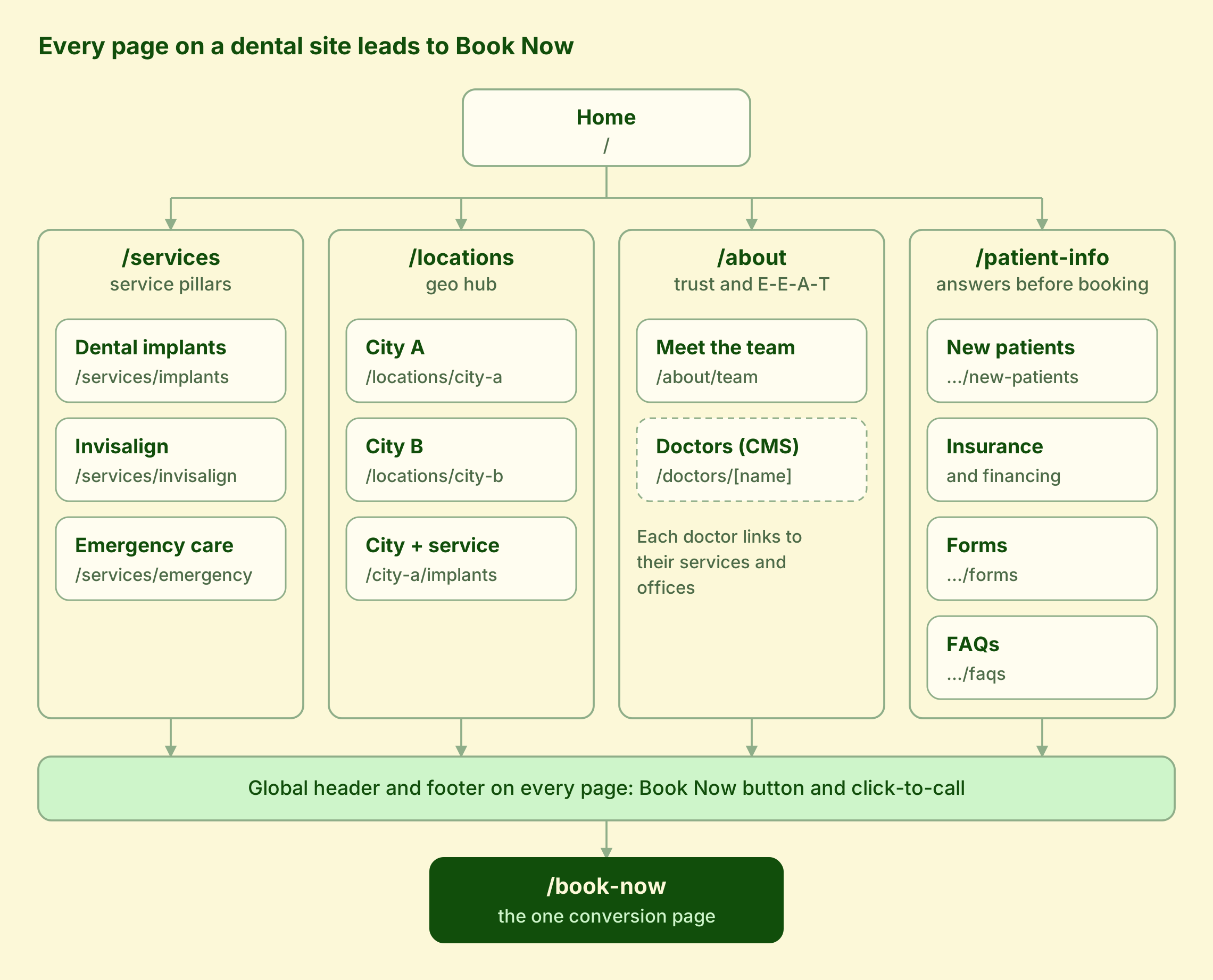
The homepage branches into four hubs. Services and locations do the ranking. About and patient info do the convincing. And every page, through the header and footer, points to one place: Book Now.
The dashed box marks the doctor pages, which live in the CMS and link across to the services and offices each doctor covers.
Every service the practice wants to be found for gets its own page. Not a paragraph on a long "Services" page. Its own page.
The /services hub lists everything the practice offers and links down to each pillar page: /services/dental-implants, /services/invisalign, /services/emergency-dentistry and so on. Each pillar page is the authority on that service. It explains the treatment, who it's for, what it costs or how financing works, what to expect, and answers the questions patients actually ask.
Why this matters: a patient searching "dental implants near me" should land on a page about dental implants, not your homepage. One page per service gives Google a clear match for every search you care about.
Start with the services that bring in the most revenue or the most new patients. For most practices that's implants, Invisalign or clear aligners, emergency care, cosmetic dentistry and general family dentistry.
Services tell Google what you do. Locations tell Google where.
The /locations hub links to a page for each city or office: /locations/kirkland, /locations/bellevue. Each city page holds that office's address, phone, hours, map, parking details, the doctors who work there, and reviews from local patients. It should match the Google Business Profile for that office exactly, so the website and the map listing reinforce each other.
The next layer is where multi-location sites win: city service pages like /locations/kirkland/dental-implants. These target the searches with the highest intent, such as "dental implants Kirkland." Each one links up to its city page and across to its service pillar, which is the grid you see in the diagram.
One warning. Don't build a city service page for every combination just because you can. Twenty near-identical pages with the city name swapped will hurt you more than help. Only build one where the office actually offers that service, and give it real local content: the doctor who performs it there, local reviews, financing details, and directions.
Patients choose a dentist, not a website. This section is where you earn their trust, and where Google checks your expertise.
The /about page tells the practice's story: why it exists, what it believes about patient care, and what makes it different. Keep it about the patient experience, not a history lesson.
/about/meet-the-team introduces everyone a patient will meet, from the front desk to the hygienists. Real photos matter here. Stock photos of smiling strangers undo the whole point.
The most important part is individual doctor pages, built as a CMS collection at /doctors/[doctor-name]. Each doctor gets their own page with:
Building doctors as a CMS collection does two things. In Webflow, reference fields let each doctor page pull their services and locations automatically, so adding a new dentist is filling in a form, not designing a page. And for SEO, these pages are your strongest E-E-A-T signal: proof that real, qualified people are behind the care. Add Person or Dentist schema to each one so search engines and AI tools understand who they are.
This is the page your front desk will thank you for. Every question a new patient calls to ask should be answered here first.
The /patient-info hub links to a small set of pages:
/patient-info/new-patients: what to expect at the first visit, what to bring, and how long it takes/patient-info/insurance-financing: which plans you accept, payment options, and a financing widget like Cherry or CareCredit/patient-info/forms: intake and medical history forms patients can fill out before they arrive/patient-info/faqs: the real questions your team hears every weekThese pages convert. A patient who isn't sure their insurance is accepted won't book. Answer it on the page and they will.
They also help with AI search. Tools like ChatGPT, Perplexity and Google's AI Overviews pull from clear question-and-answer content. Write your FAQs the way patients ask them, and mark them up with FAQ schema.
Every page on the site exists to get a patient to one place: /book-now.
The global header and footer appear on every page, and both carry a Book Now button and a click-to-call phone number. On a multi-location site, the booking page lets patients pick their office first, then shows that office's online scheduler or request form.
Keep it simple. A patient who has decided to book shouldn't have to hunt through five fields and a captcha. Fewer steps means more appointments, and it's the easiest conversion win on most dental sites.
The structure only works if the pages link to each other the right way. These are the rules I follow:
/services/dental-implants, not /page-id-4821 or /our-amazing-implant-services.Good internal linking spreads authority from your strongest pages to the ones you want to rank, and it helps patients find what they need in two clicks or fewer.
A good-looking dental website gets compliments. A well-structured one gets patients. If your site has one Services page, no doctor pages, and a contact form buried in the footer, the structure is what's holding it back.
Want to know how your site stacks up? I'll review your structure and show you exactly what I'd change.